Bringing new life into an existing design system.
Background
Ladiosa, reconnectiong with their customer base.
We developed a simple and elegant font as the basis for the

A guiding title
As a Taiwanese company, Ladiosa had seen a stagnation in their growth, as such they decided to
Solosolo was tasked with redesigning their Visual Identity, maintaining a link to their roots in Taiwan and moving it forward to appeal to a more worldly audience.
Development
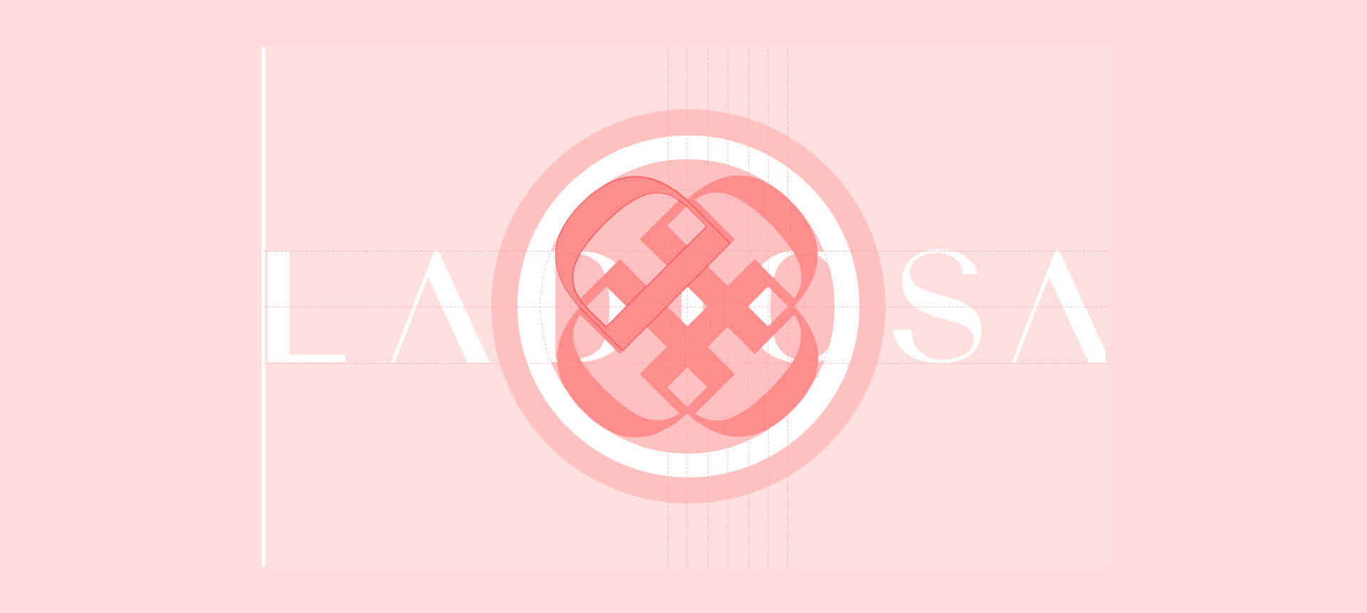
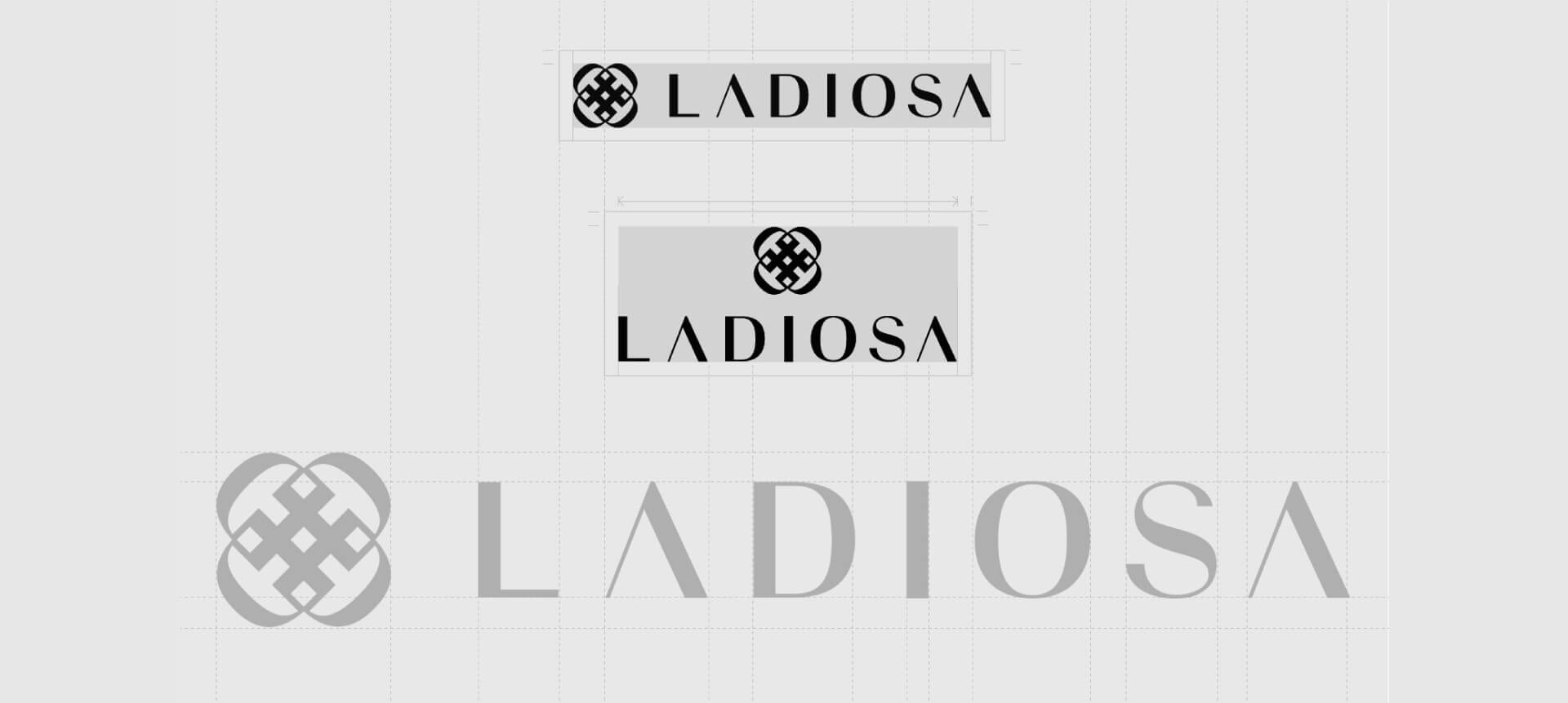
The logo idea is a combination of traditional Chinese knot making and weaving, formed of the Prominent “D” shape that is present within the lettering of the logo.


